
Stark
We built Perception, so take this comparison with that context. We've tried to be accurate about both tools. If something here is wrong, let us know.
Who should switch, and who shouldn't
Contrast checking is your primary accessibility task in Figma before handoff
You work on design systems where icon contrast and complex fills come up regularly
You want a free tool that works properly without hitting a project cap
You're a freelancer or small team where $120/year per person is hard to justify for one job
You already use Stark for other features but want more accurate contrast results on icons and layered designs
You need more than contrast - focus order, alt text, touch targets, vision simulation
Your team produces compliance reports or needs VPAT documentation
You want one tool to cover most of your Figma accessibility workflow
Your organisation has budget for a full accessibility platform
You need CI/CD integration in your development pipeline
Comparison
How Perception compares
| Feature | Perception Free | Perception Pro | Stark Free | Stark Pro | Contrast | Able |
|---|---|---|---|---|---|---|
Pricing | ||||||
| Annual Cost | Free | £39.99/yr | Free | $120/yr | Free | Free |
Core Contrast | ||||||
| Text Contrast | Included | Included | Included | Included | Included | Included |
| Icon Contrast | Included | Included | Not included | Not included | Not included | Not included |
| Dominant Colour Detection | Included | Included | Not included | Not included | Not included | Not included |
| Shows Contrast Ratio | Included | Included | Included | Included | Not included | Included |
| Shows Tested Colours | Included | Included | Included | Included | Not included | Included |
| Opacity Support | Included | Included | Included | Included | Included | Not included |
Standards | ||||||
| WCAG 2.0 | Included | Included | Included | Included | Not included | Not included |
| WCAG 2.1 | Included | Included | Included | Included | Included | Included |
| WCAG 2.2 | Included | Included | Included | Included | Not included | Not included |
| AA + AAA | Included | Included | Included | Included | Included | Included |
| APCA | Coming soon | Coming soon | Not included | Included | Included | Not included |
Workflow | ||||||
| Bulk Scanning | Included | Included | Not included | Included | Included | Not included |
| Component + Instance Support | Included | Included | Not included | Included | Included | Not included |
| Links to Tested Node | Included | Included | Not included | Included | Included | Not included |
| Ignore False Positives | Not included | Not included | Not included | Included | Not included | Not included |
| Auto Monitoring | Not included | Not included | Not included | Included | Not included | Not included |
Beyond Contrast | ||||||
| Type Size Checking | Included | Included | Not included | Not included | Not included | Not included |
| Touch Target Size | Not included | Not included | Not included | Included | Not included | Not included |
| Vision Simulator | Not included | Not included | Not included | Included | Not included | Included |
| Focus Order | Not included | Not included | Not included | Included | Not included | Not included |
| Alt Text Annotations | Not included | Not included | Not included | Included | Not included | Not included |
| Compliance Reporting | Not included | Not included | Not included | Included | Not included | Not included |
Perception does contrast checking. It does it accurately, including for icons and complex fills. It doesn't try to be a full accessibility suite - if you need vision simulation, focus order, alt text, and compliance reporting, Stark's paid plans cover that.
For an honest comparison of every major plugin, read The Best Figma Plugins for Accessibility Testing on benjaminwalsh.co.uk.
How it works
How it works
Select your layers
Pick frames, components, sections, entire pages, hell anything you want to check
Run a scan
Perception finds text and icon elements, detects foreground and background colours, and calculates contrast ratios
Review results
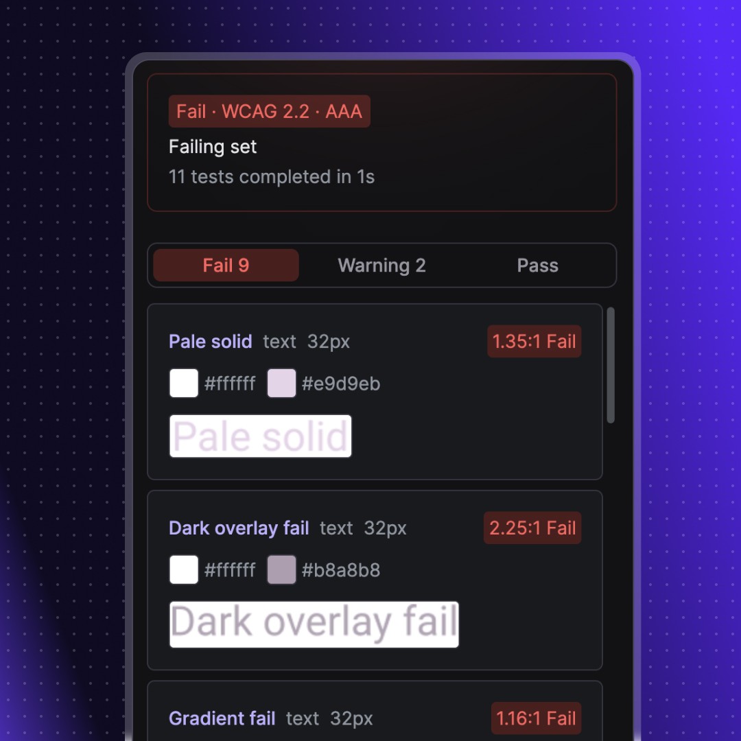
Filter by pass or fail. See the exact colours, contrast ratio, and WCAG level for each element
Fix and re-test
Jump to any failing node, fix it, and re-test that specific result without re-running the full scan
Features
Features
Scan text and icons against WCAG 2.0, 2.1, and 2.2 AA/AAA all in bulk
Bulk testing
Dominant colour detection handles gradients, images, opacity, and blending
Context aware detection
Individual re-testing; jump to any failed node in your designs instantly
Quick re-tests
Switch colour formats HEX, RGB, HSL, HSB. Small-text and readability warnings
Customisable
Pricing
Pricing
Where other tools break on gradients, images, and layered fills, Perception uses dominant colour detection to test what users actually see.
Coming soon
Features in development
Override detected colours when you know the actual value
Manual colour overrides
Test against the Advanced Perceptual Contrast Algorithm alongside WCAG
APCA contrast mode
Save test data to the canvas and reopen it later
Persistent results
Join 126 other insiders who still care about design
Becoming an insider means you'll be the first to hear about new tools, products, and features. Have your say on our product roadmap, and get exclusive discounts.
By subscribing you agree to our privacy policy

FAQ
Frequently asked questions
We built Perception, so take this comparison with that context. We've tried to be accurate about both tools. If something here is wrong, let us know.
Perception is a contrast checker. It tests text and icon elements against WCAG 2.0, 2.1, and 2.2, handles complex fills properly using dominant colour detection, and doesn't have a project limit on free. Pro is £39.99/year.
Stark is a full accessibility platform. Contrast, vision simulation, focus order, alt text annotations, touch targets, compliance reporting - it's all in one place. The free tier is limited. Pro starts at $120/year for individuals.
If you need contrast checking done accurately: Perception.
If you need a full accessibility platform in Figma: Stark.
Contrast checking is your primary accessibility task in Figma before handoff
You work on design systems where icon contrast and complex fills come up regularly
You want a free tool that works properly without hitting a project cap
You're a freelancer or small team where $120/year per person is hard to justify for one job
You already use Stark for other features but want more accurate contrast results on icons and layered designs
You need more than contrast - focus order, alt text, touch targets, vision simulation
Your team produces compliance reports or needs VPAT documentation
You want one tool to cover most of your Figma accessibility workflow
Your organisation has budget for a full accessibility platform
You need CI/CD integration in your development pipeline
Feature | Perception | Stark (Pro) |
|---|---|---|
Text contrast | Yes | Yes |
Icon contrast | Yes | Limited |
Dominant colour detection | Yes | No |
Vision simulator | No | Yes |
Focus order | No | Yes |
Alt text annotations | No | Yes |
Touch target checking | No | Yes |
Typography analysis | No | Yes |
Landmarks | No | Yes |
Compliance reporting (VPAT) | No | Yes |
Auto monitoring | No | Yes |
CI/CD integration | No | Yes (Grow plan, $6,000+/year) |
Perception does one thing: contrast checking. Stark does many things. If your accessibility workflow in Figma goes beyond contrast, Perception isn't a replacement.
Verdict: Stark wins on breadth. If you need the full platform, Perception doesn't cover it.
Tier | Perception | Stark |
|---|---|---|
Free | Full contrast checking - text and icons, bulk scanning, all WCAG versions, no project limit | Basic contrast checker and vision simulator, five projects max |
Individual paid | £39.99/year | $120/year |
Teams | Same price per account | $15/seat/month, five-seat minimum ($900/year minimum) |
Enterprise/CI | Not available | $6,000+/year (Grow plan) |
Verdict: Perception is cheaper - significantly so at team scale. But you're comparing a contrast checker to a platform. The price gap reflects the scope gap.
Perception free | Stark free | |
|---|---|---|
Contrast checking | Yes - text and icons | Yes - text only |
Bulk scanning | Yes | No |
Components and instances | Yes | No |
Dominant colour detection | Yes | No |
WCAG versions | 2.0, 2.1, 2.2 | 2.1 and 2.2 |
Project limit | None | Five projects |
Vision simulator | No | Yes |
Verdict: If you're on free, Perception gives you more for contrast checking. Stark's free tier includes vision simulation, which Perception doesn't have at any tier.
For a team of ten designers doing contrast checking:
Perception Pro: £400/year
Stark Pro: $1,200/year
Stark Team: $1,800/year
That's a meaningful difference if contrast checking is most of what you use.
Contrast checking accuracy
For text on flat, solid backgrounds, both tools give you the same result. The maths is identical.
The difference shows up on more complex designs.
Icons. WCAG 2.2 SC 1.4.11 requires non-text UI components - including icons - to meet 3:1 contrast. Perception detects icons automatically and tests them in every scan. Stark's contrast checker is built around text. You won't get a systematic icon contrast report from Stark the way you do from Perception.
Gradients and image fills. When your text or icon sits on a gradient, image background, or layered fill with blending modes, Perception uses dominant colour detection to calculate contrast from the colour users actually perceive. Stark reads the direct fill value. On simple gradients the difference might be small. On complex layered backgrounds with opacity and effects, the numbers can diverge enough to matter.
Verdict: Perception is more accurate for contrast checking on icons and complex fills. For text on flat backgrounds, both are equivalent.
WCAG version coverage
Perception supports WCAG 2.0, 2.1, and 2.2. Stark supports 2.1 and 2.2. In most cases this won't matter - 2.2 is backwards-compatible. But if you're working against legacy compliance requirements that cite 2.0 specifically, Perception covers it.
Both support AA and AAA.
Verdict: Perception has broader WCAG coverage. Rarely a deciding factor.
Updates and maintenance
Perception is built by one person (Ben Walsh, who also wrote this comparison). Updates ship regularly. The roadmap includes APCA contrast mode, manual colour overrides, and persistent results.
Stark has a full team. They raised $1.5M in 2022. Updates are frequent. In late 2024, Stark restructured pricing and features around team and enterprise use - a clear signal that their roadmap is tilted toward larger organisations.
Verdict: Both are actively maintained. Stark has more resource. Perception moves faster on contrast-specific features because it's the only thing it does.
Some teams use Perception for contrast (especially on icons and complex designs) and Stark for everything else - focus order, alt text annotations, touch targets. The plugins don't conflict. If you're already paying for Stark and finding the contrast results unreliable on icon-heavy files, adding Perception on free costs nothing.
Did you really build Perception and write this comparison?
Yes. We've tried to be accurate about both tools. Stark does things Perception doesn't. Where we think we do a better job, we've said why and what specifically makes it better. If something here is wrong, email us.
Can Perception replace Stark entirely?
Only if you only use Stark for contrast checking. If you use focus order, alt text, vision simulation, or compliance reporting, you still need Stark or other tools for those.
Is Perception's contrast checking actually more accurate?
For icons: yes - Perception detects and tests them as a standard part of every scan. Stark's contrast checker doesn't systematically cover icons. For complex backgrounds (gradients, images, blending modes): yes - dominant colour detection gives a more realistic result than reading direct fill values. For text on flat backgrounds: both are equally accurate.
Will Perception add the features Stark has?
APCA contrast mode and persistent results are on the roadmap. Vision simulation, focus order, and alt text are not. Perception is a contrast checker - the goal is to do that one thing as accurately as possible, not to build a full accessibility platform.